The Brand
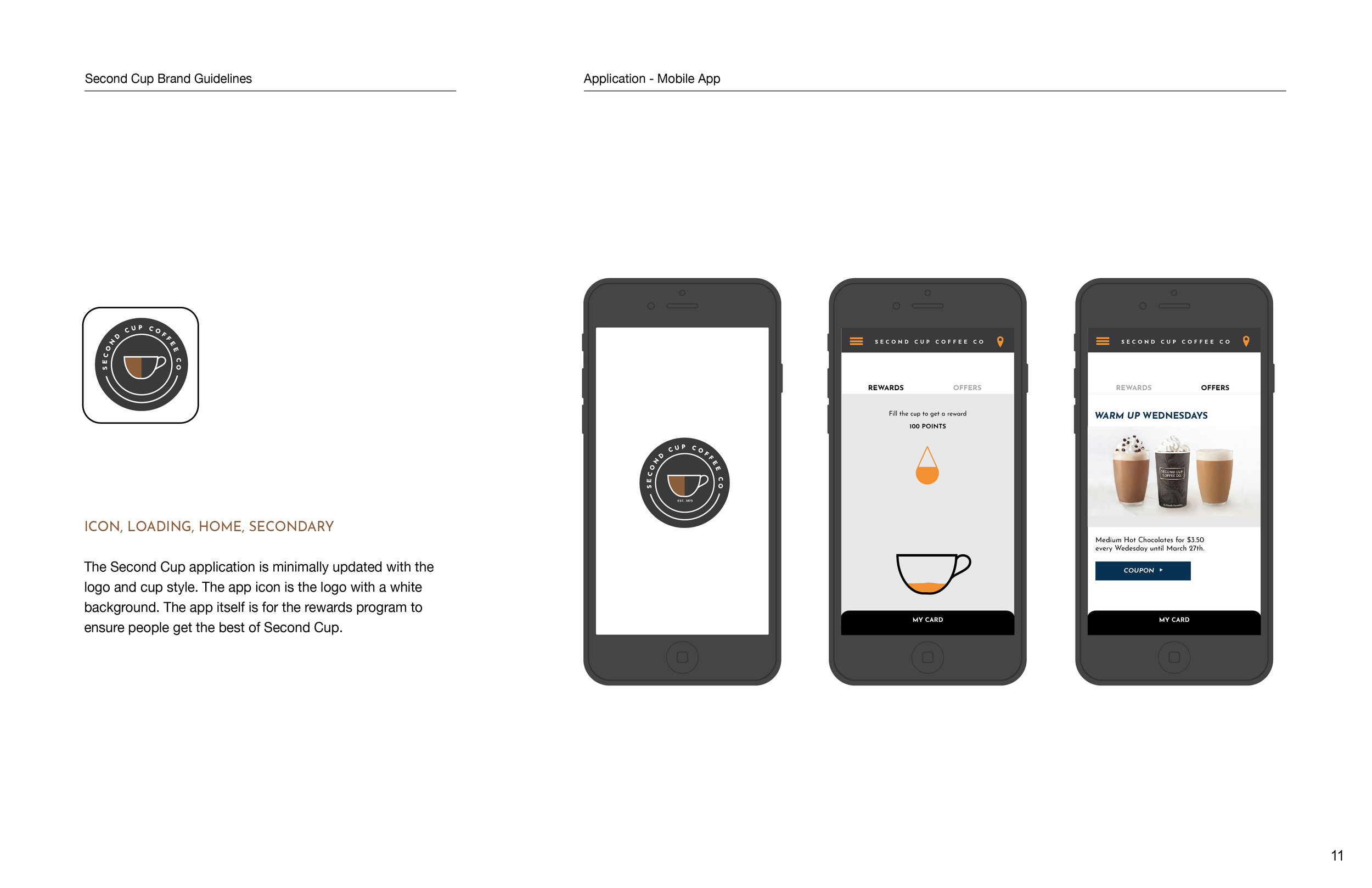
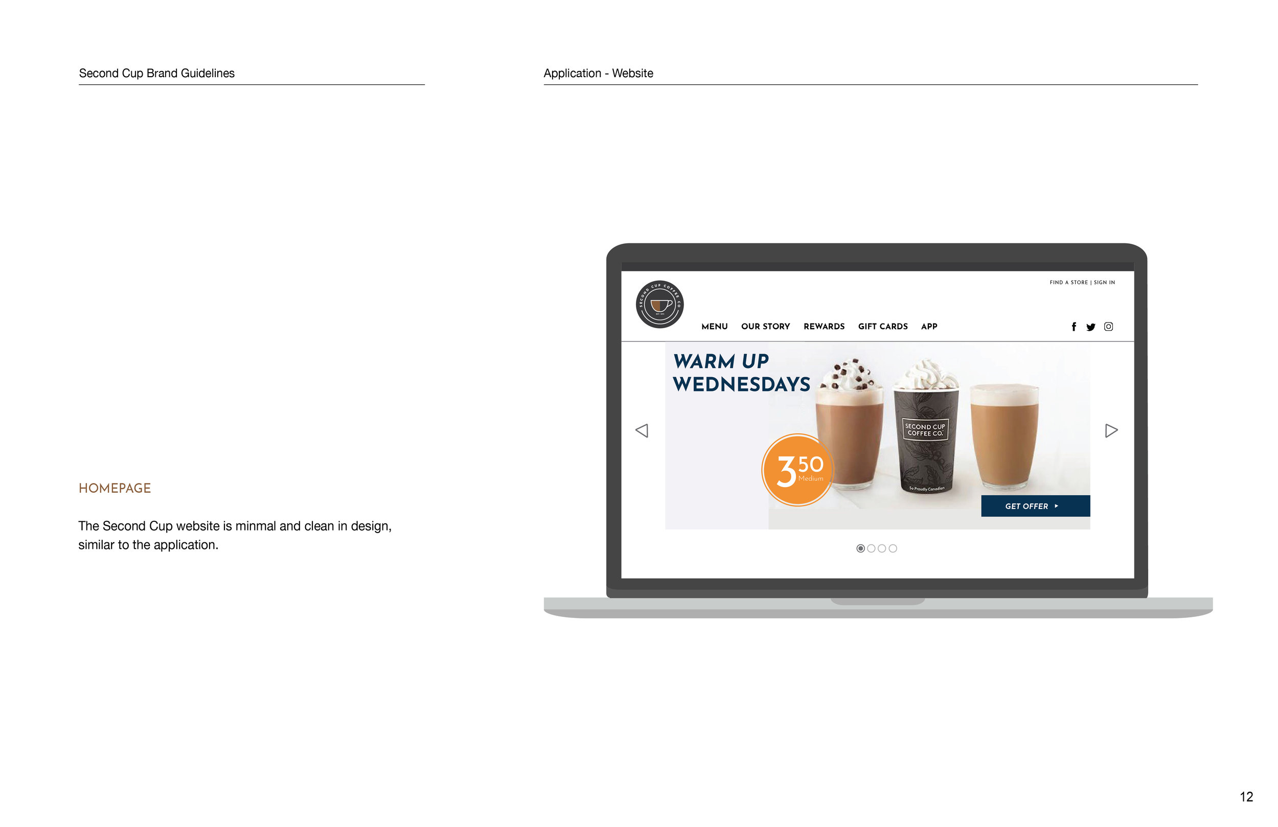
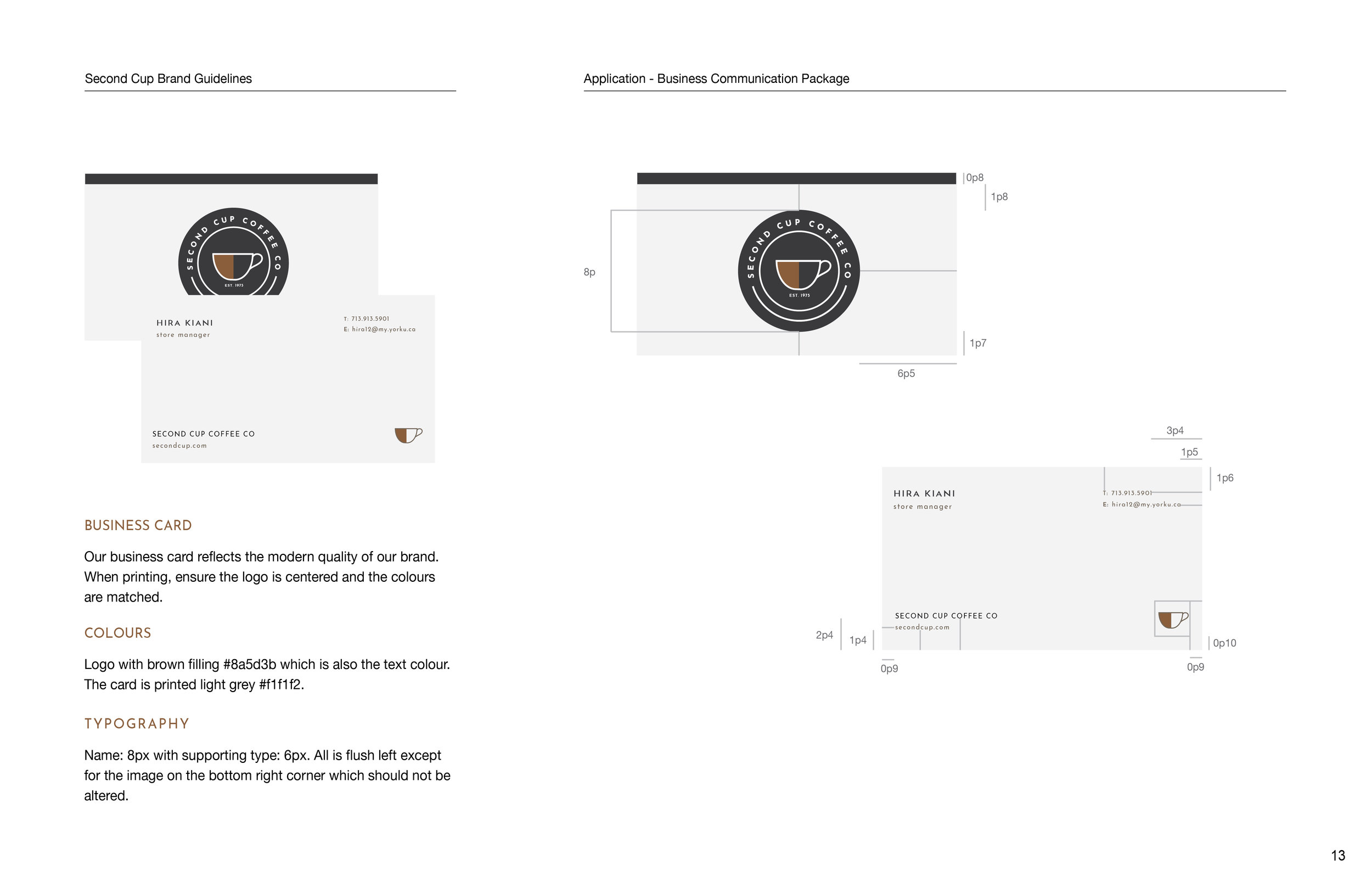
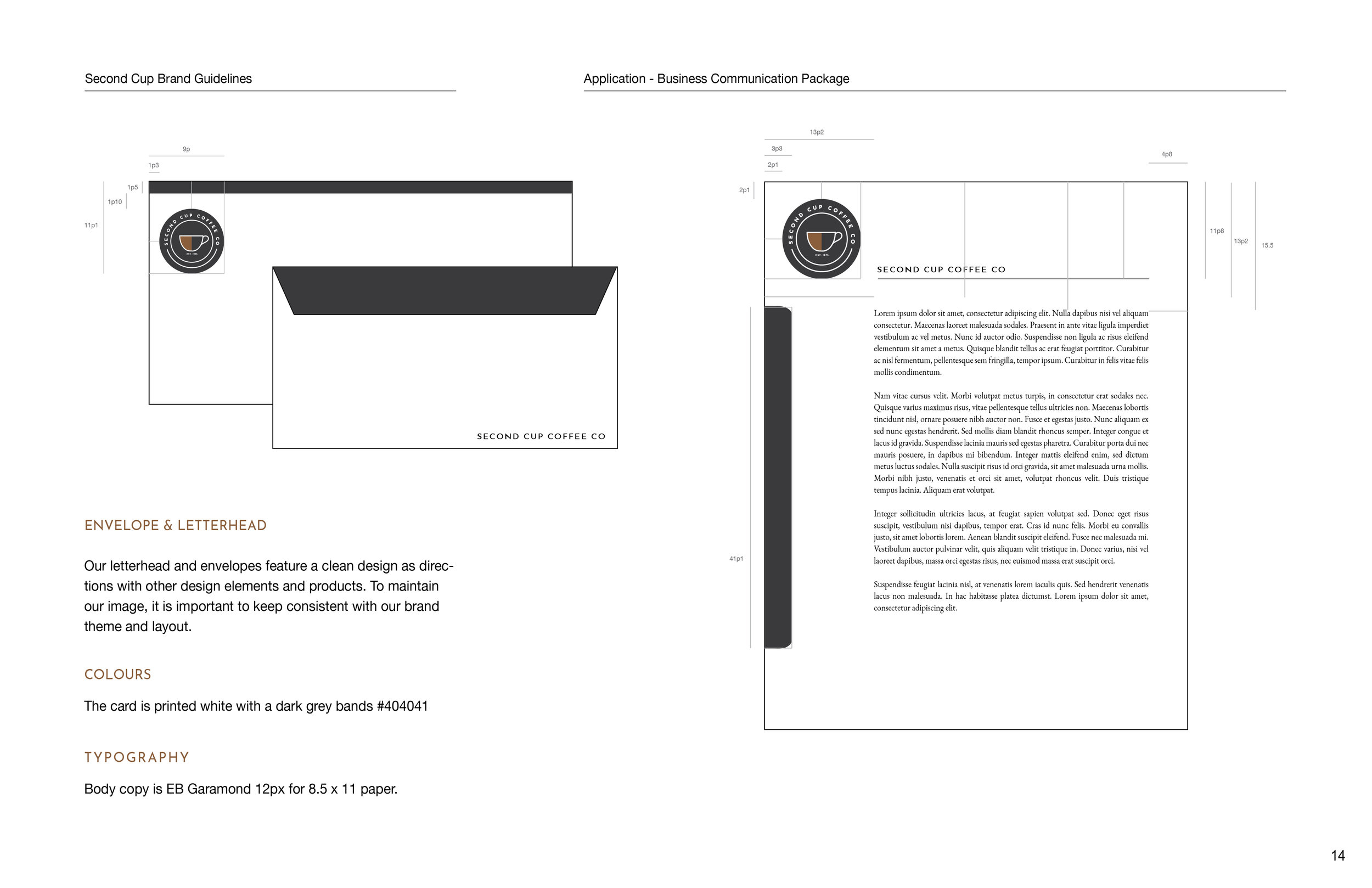
Second Cup has long attracted the older audience, and after their rebrand to Second Cup Coffee Co., the company hoped to see more popularity with the younger audience and to generally have a more lively and modern feel. And while the brand has been modernized, it lacks character that the Second Cup franchise strives to have.
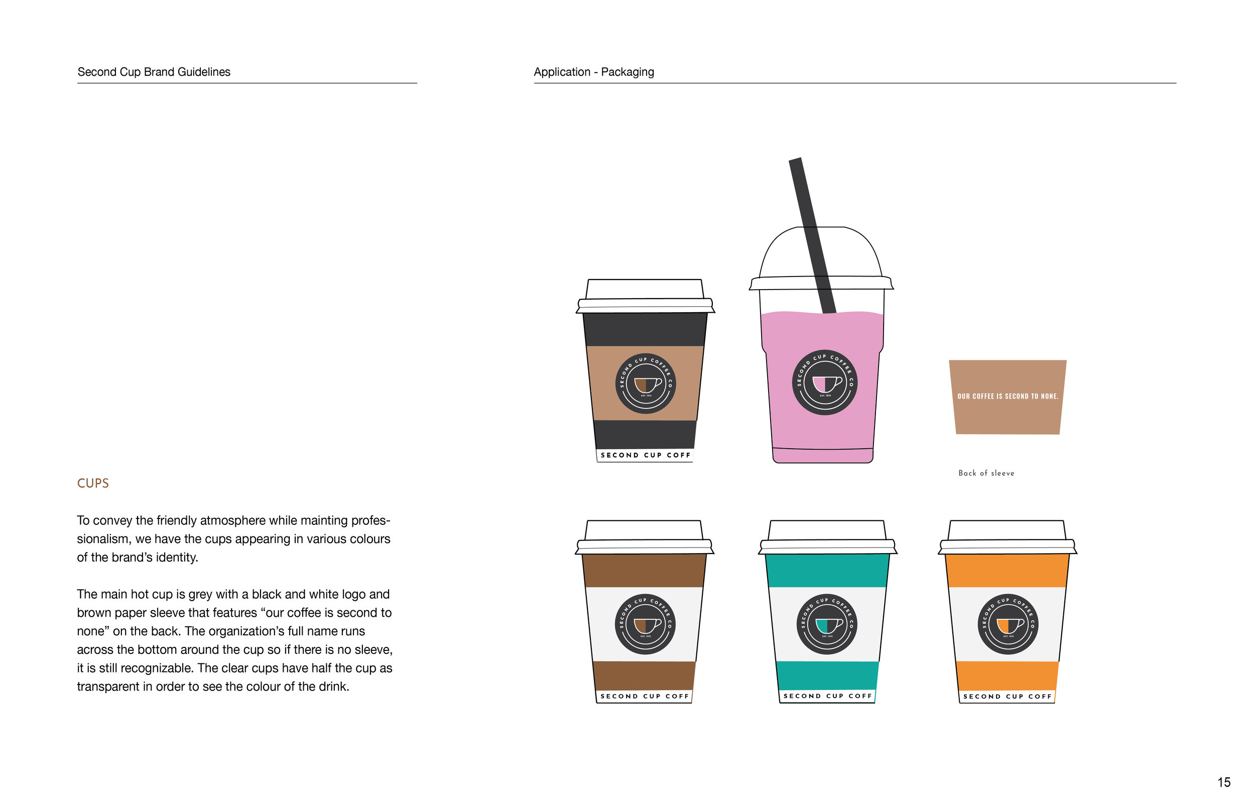
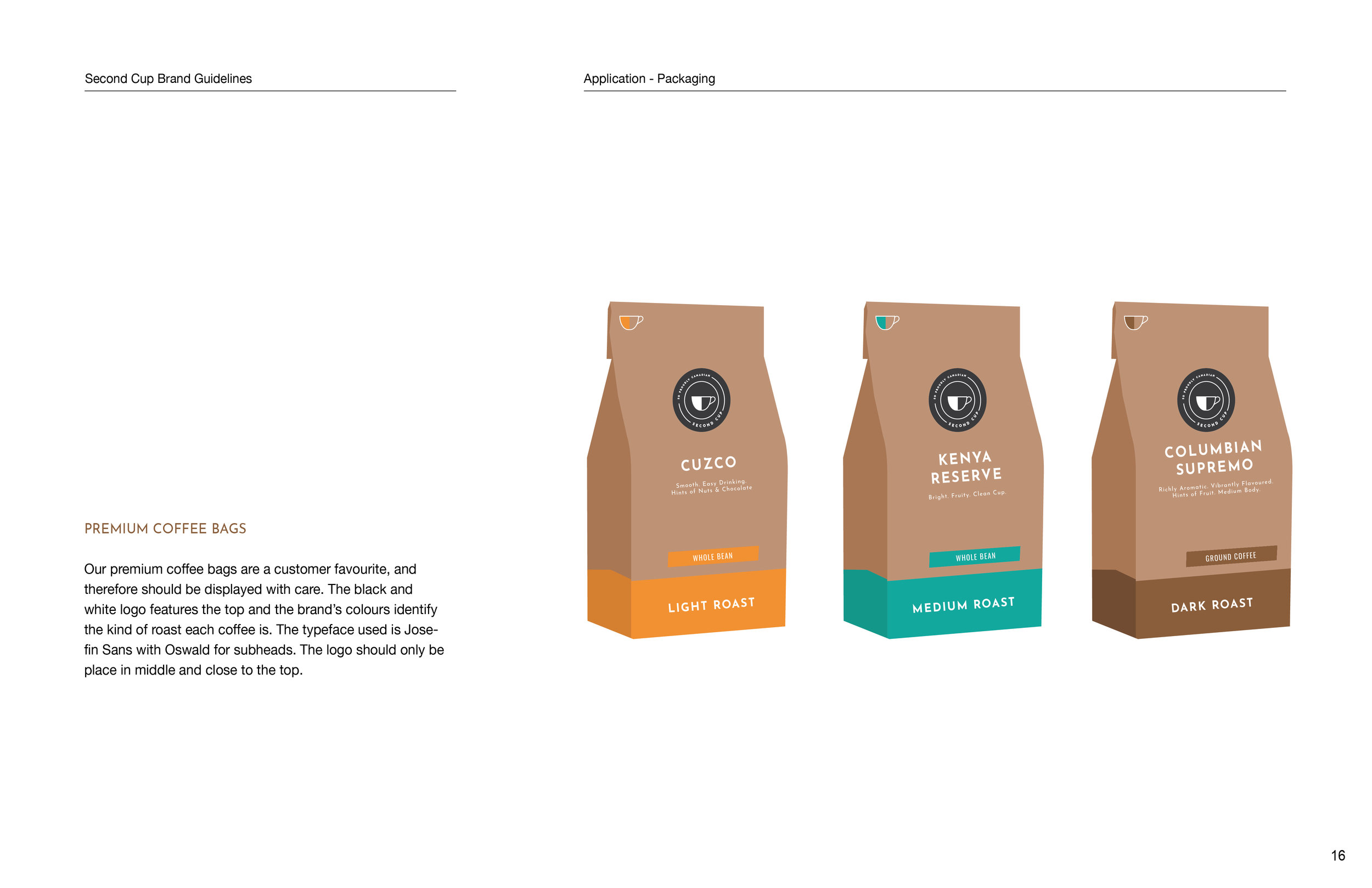
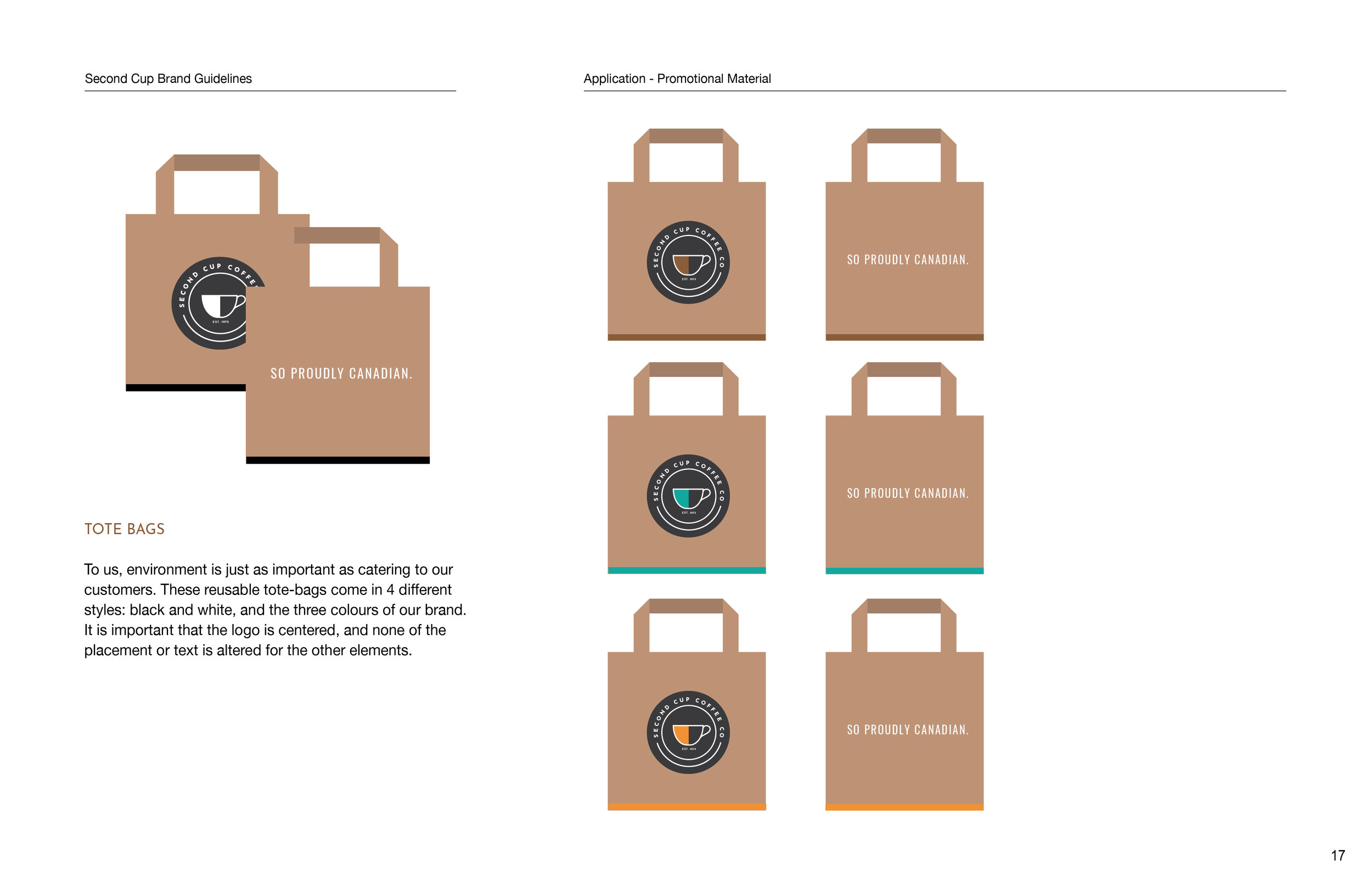
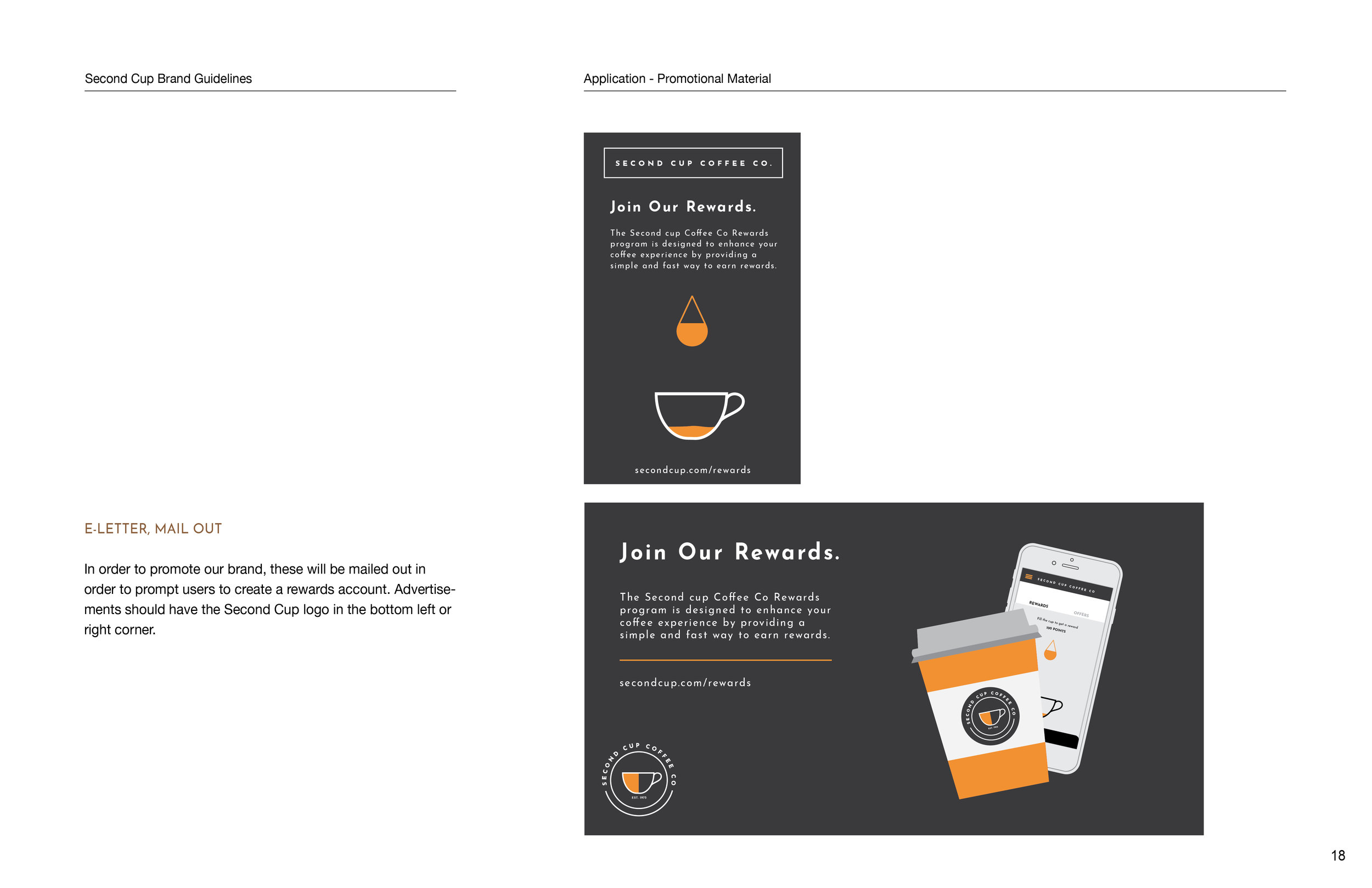
The aim of this project is to rebrand Second Cup to appeal to a younger audience by being fresh, innovative, and full of character.
The Problem
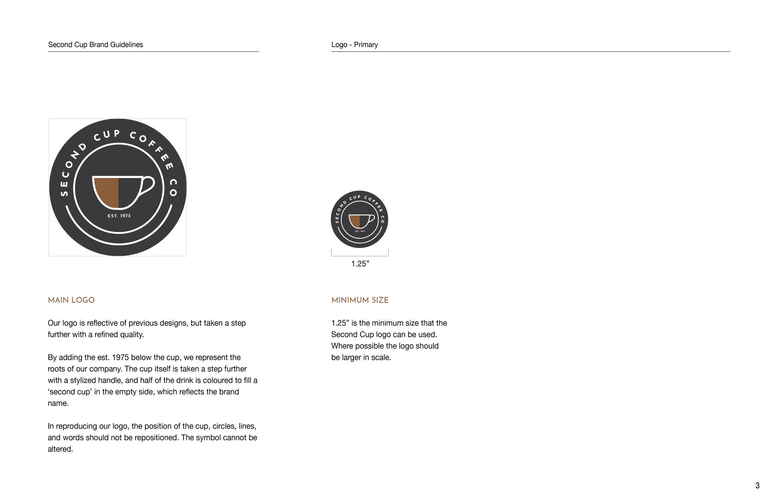
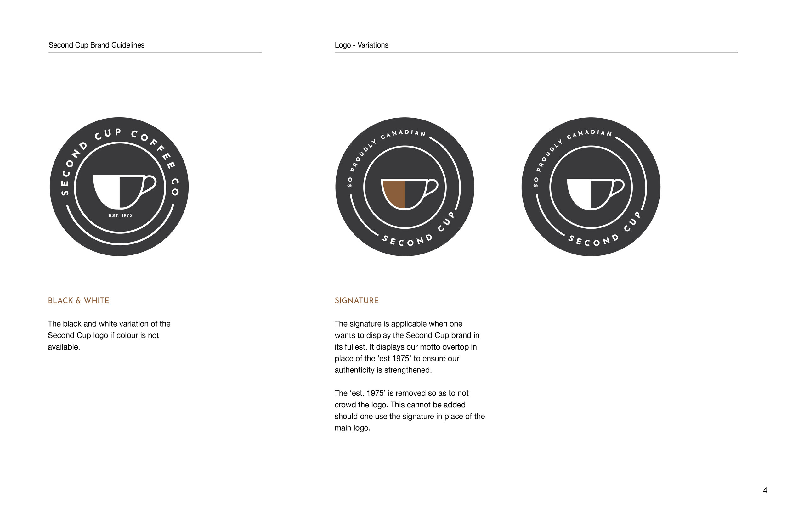
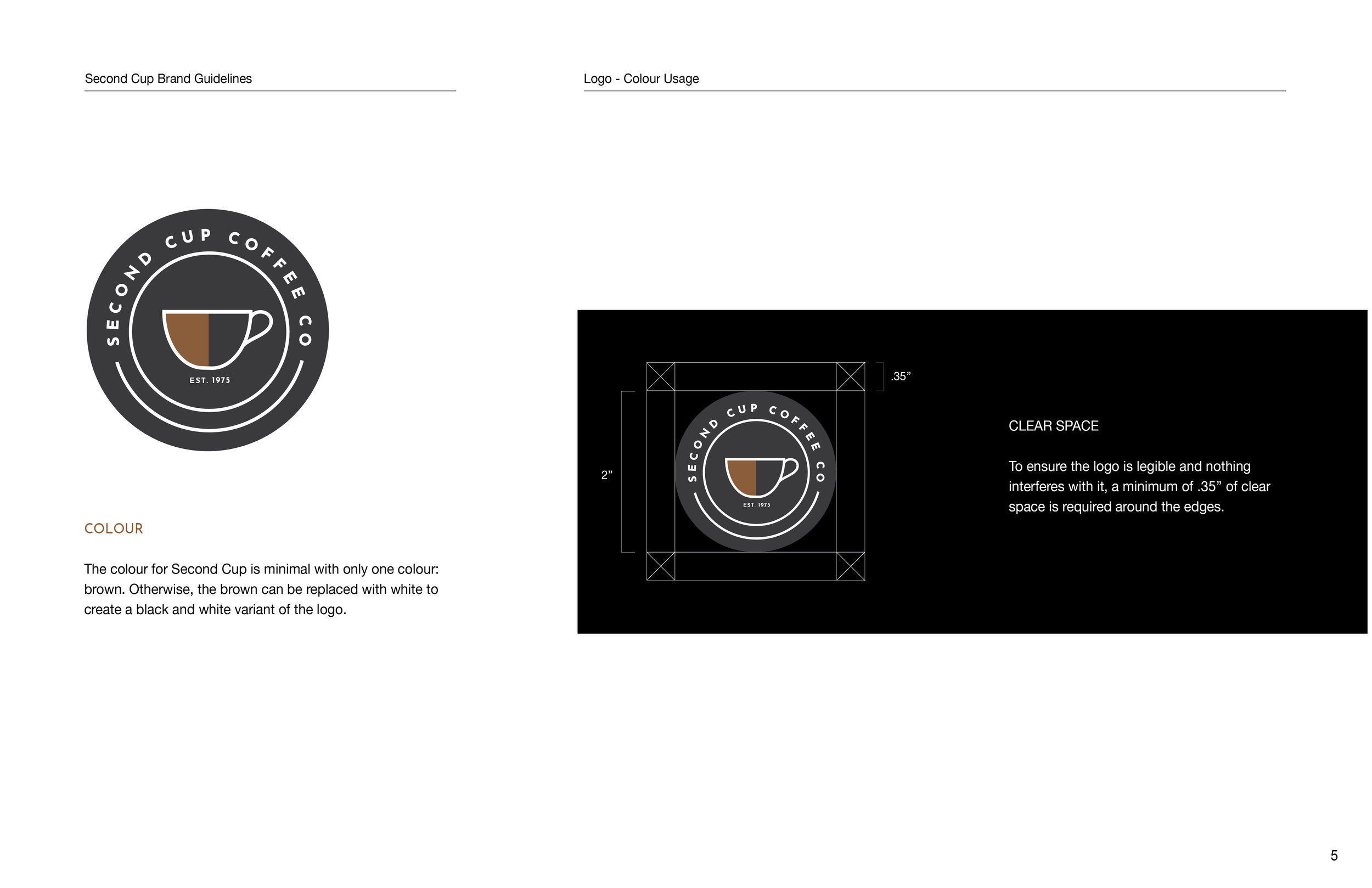
Second Cup’s current logo features a minimal and clean design, but isn’t executed strongly. The sans-serif typeface in the logo is too typical and mechanical, without any personal quality to it. The alternative circular logo is also too simple, with a simple coffee cup in the middle. The aim is to bring to light the artisanal values they hold, and to add character with a bolder design. Adding a stronger typeface and a better refined image for the logo will elevate the brand.
Current primary Second Cup Coffee Co. logo.
Current Secondary logo.
Challenges
A logo that conveys what Second Cup Coffee Co. is all about: quality coffee and a memorable experience.
Incorporating intelligent, yet bold and fresh design that has a sense of innovation to it, attracting a younger audience.
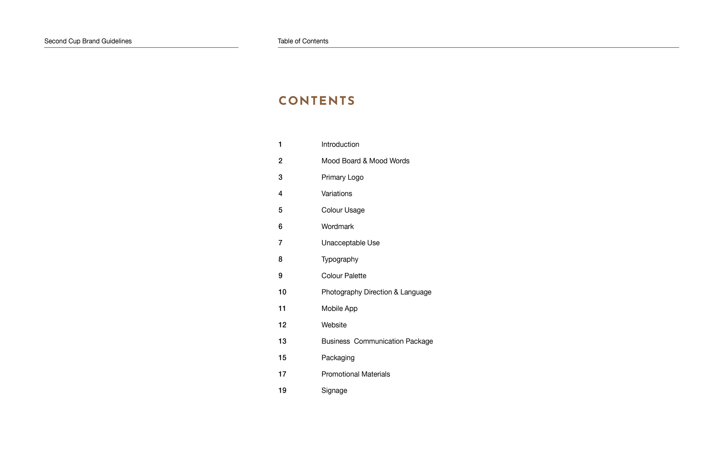
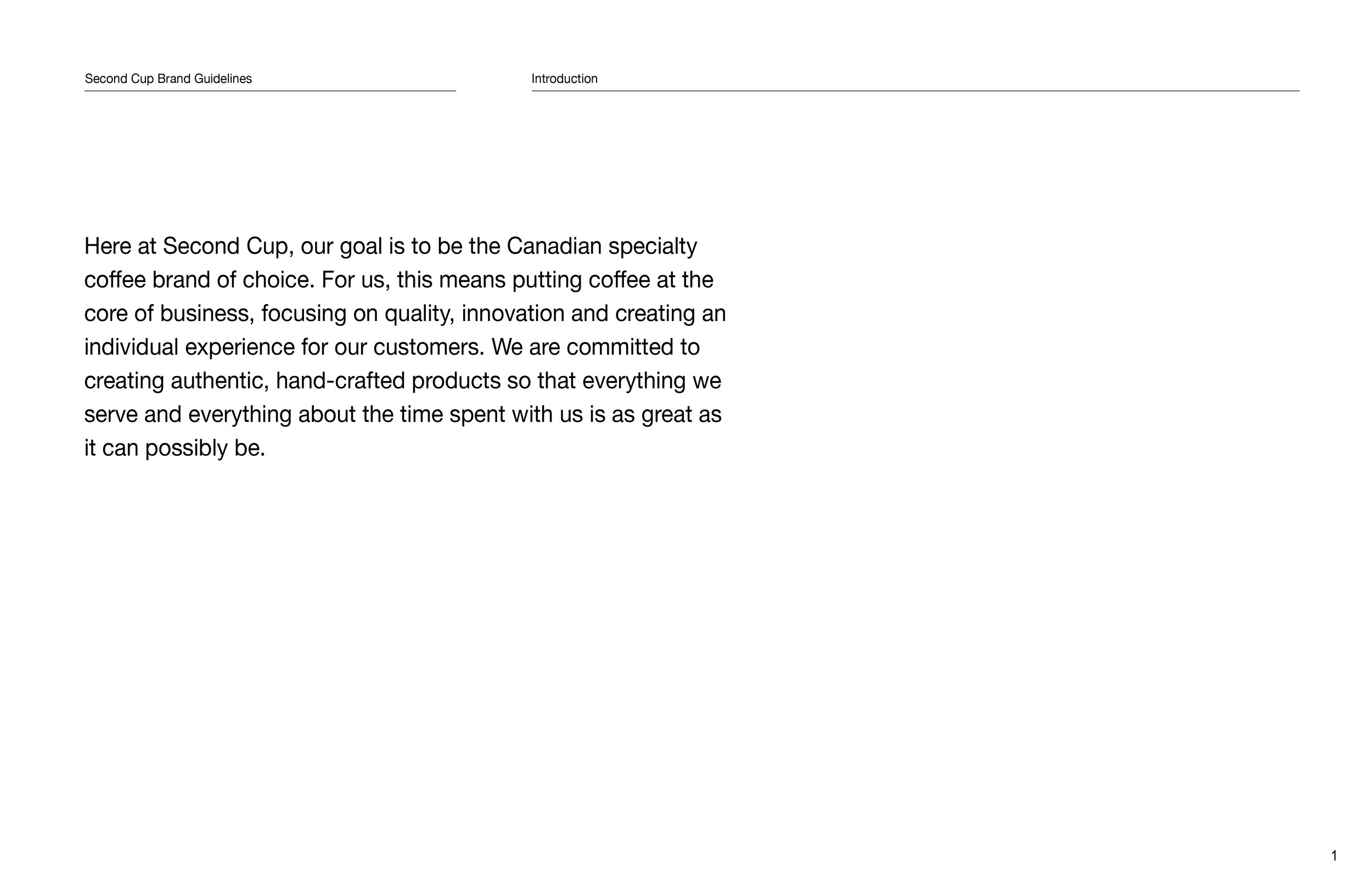
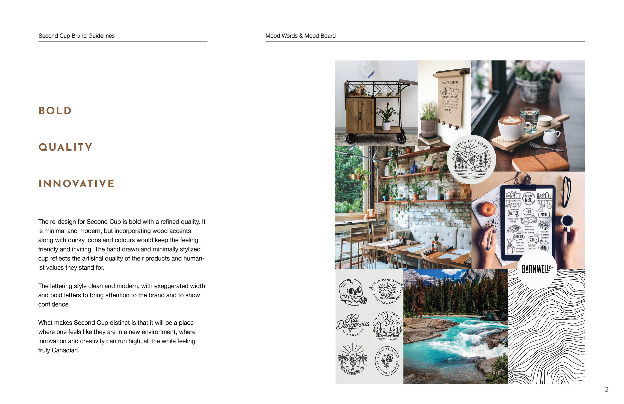
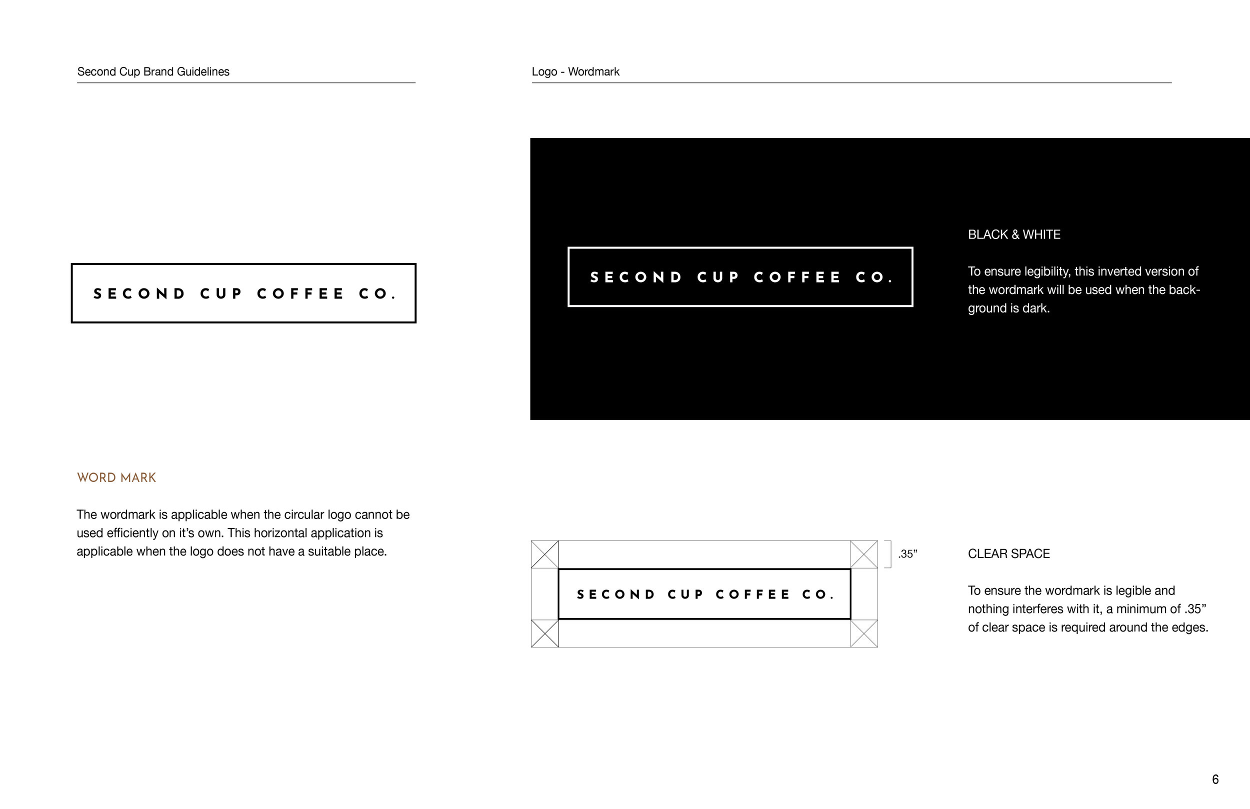
View the full brand guide below.
